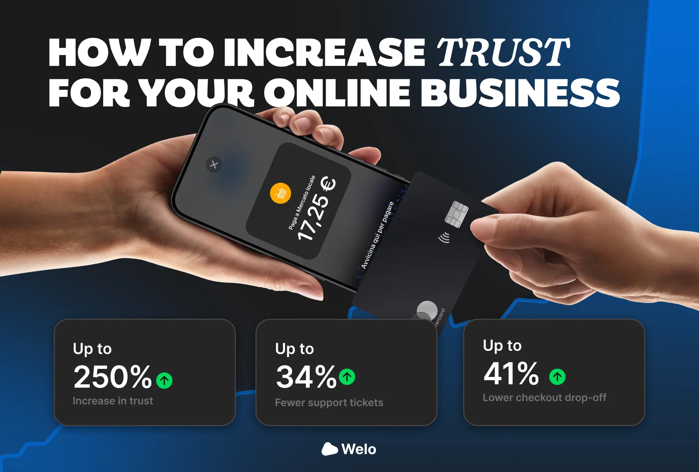
Checkout is where a brand stops storytelling and has to prove reliability to a shopper who already has natural doubts about returns, delivery, final costs, payment methods, and support quality.
When even one essential piece of information isn’t immediately clear, shoppers do what they do best, they postpone, open new tabs, look for reassurance elsewhere, or abandon and never come back.
This report was built to measure that moment with a repeatable approach, based on public signals anyone can observe, and to turn those signals into an actionable checklist that reduces the Trust Gap.
We analyzed over 200 brands across the United States and Canada, selecting high volume, highly recognizable companies, the analysis was conducted through public, standard paths, navigating from PDP to cart and checkout, observing the content and trust signals shown before the purchase decision, and verifying consistency between what is promised and what shoppers actually see at the moment of payment.
The model assigns a total score from 0 to 100, called the Welo Trust Gap Index, calculated by summing four pillars, each built on simple metrics with clear scales and thresholds that allow comparisons across brands.
Internal classification, not public, used to segment priority and risk, 85–100 Trust Leader, 70–84 Verified ready, 50–69 Needs improvements, below 50 High risk signals.
The checklist is structured into four pillars, each metric has a score, and the goal isn’t to add more elements, it’s to place the right information in the right place, in a clean, consistent, and verifiable way.
Here we summarize the most important results, directly tied to the checklist metrics, these are the gaps that appear most often, and that tend to hit at the most delicate moment, when the shopper is deciding whether to pay.
The Trust Gap isn’t an aesthetic flaw and it isn’t a “lack of marketing” problem, it’s the distance between what shoppers need to know to feel safe and what the brand makes immediately verifiable.
When that distance grows, the mental cost of checkout increases, and checkout becomes a sequence of checks, not a confirmation, the result is that even big brands with strong products can lose conversions over avoidable details.
The most interesting part of the benchmark is that many of these gaps don’t require a redesign, they require precision, placement, and consistency, making the answer appear before the question even forms.
When shoppers can’t find returns and refunds while evaluating the product, they read the absence as risk.
The sample data, 39% without a direct returns link or information in the PDP, suggests that a meaningful share of brands keeps this information too far away, often buried in the footer or inside legal pages that are hard to read on mobile.
The most effective improvement isn’t adding long text, it’s making the signal short and clickable in the right context, one line near the price or under the shipping section, with a link to the full policy, so shoppers immediately understand the purchase is reversible.
The most fragile point in checkout is a surprise total, because it turns a purchase into suspicion, even when the cost is legitimate.
In the Welo sample, 32% don’t show shipping costs or a calculator in the PDP, and 9% don’t show them even in the cart, which means many shoppers discover the real total too late, right when they’re about to pay.
Closing this gap means showing it earlier, even with estimates, and repeating it, shoppers need to feel guided, not caught off guard, a simple shipping calculator, a clear free shipping threshold, and a tax estimate when possible can do more than a lot of design
Fast shipping isn’t an answer, it’s a slogan.
The data, 38% without a real delivery date, shows that concrete delivery windows are often missing, and when they’re missing, shoppers imagine the worst case, delays, no tracking, indefinite delivery.
A realistic range, repeated in the cart and near payment, reduces the need to go back or look for external confirmation, and increases the sense of control.
Payment is compatibility, not just technology.
If shoppers reach the end and discover their preferred method isn’t available, they abandon, with no negotiation.
In the sample, 27% fail to offer more than one payment method, or fail to communicate it early, which creates friction especially on mobile, where wallets and fast payments can be a major conversion driver.
The fix is often simple, make methods visible earlier, and don’t let shoppers discover them only at the final step.
Checkout almost never fails at the beginning, it fails near the decision.
The data, 53% mobile and 49% desktop rated mediocre or worse, shows that many experiences become less clear exactly when they should become clearer, support isn’t visible, promises aren’t repeated, steps create anxiety, microcopy doesn’t answer real questions.
One rule matters here, near the confirmation button, the answers must be there, returns, shipping, support, security, cleanly, in a few lines, with zero noise.
Performance isn’t just speed, it’s credibility.
The sample shows desktop is often strong, but mobile has a Lighthouse median of 55, which usually means heavy assets, too many scripts, unstable layout, late loading elements, and shoppers feel like something isn’t under control.
When the site stutters or reloads, the shopper’s brain associates instability with risk, especially while entering payment details.
Reviews are a shortcut to trust, especially for first time buyers.
The data is clear, 58% of PDPs have no reviews, so shoppers have to look for reassurance elsewhere, and every external step increases drop risk.
The key isn’t having many reviews, it’s having reviews where the decision happens, with authenticity signals, dates, counts, sorting, and a structure that feels real.
If you’re investing in ads or influencers, this report tells you what to audit before increasing spend, because more traffic to a checkout that creates doubts only amplifies waste.
If you’re working on product, it shows which changes have the best impact to effort ratio, often small moves, placing returns in the PDP, surfacing costs earlier, making delivery windows concrete, showing payments early, repeating key promises near payment, keeping mobile light and stable, and bringing reviews into the PDP.
If you manage support and operations, it highlights which gaps generate tickets, disputes, refunds, and frustration, because trust doesn’t only reduce abandonment, it also reduces operational cost.
Welo Badge exists to turn public trust signals into a measurable system, repeatable and improvable over time.
When we analyze a brand, we don’t just list what’s missing, we link every gap to its impact on the purchase journey, and we deliver practical fixes, placement, microcopy, and priorities, balancing quick wins with structural improvements.
The result is a clear path, understand where trust is being lost, fix the critical points near the decision, measure again, and when the brand is ready, activate certification with the Welo Badge e and a public page that makes the work transparent, so trust isn’t just promised, it’s proven.


Rise above the usual.